本文发表于新加坡政府开放数据门户站的博客,经授权由 InfoQ 中文站翻译并分享。
撰文: Daniel Sim | 分析: Lee Shangqian、Daniel Sim、Clarence Ng
编者按:大数据正在渗透各行各业,甚至能跟你考试能力测试、患上某种疾病的机率等非常生活化的场景应用都发生紧密的联系。今后大数据在我们的生活中就像是水和电一样,让社会整个信息质量更好、让信息利用效率更高效。
世界著名未来学家托夫勒曾说改变这个世界的力量有三种暴力、知识、金钱,而如今我们的世界正在被第四种力量改变,那就是大数据!大数据不管应用在哪个行业它的核心都是通过技术来获知事情发展的真相,最终利用这个“真相”来更加合理的配置资源。具体来说,要实现大数据的核心价值,还需要前两个重要的步骤,第一步是通过“众包”的形式收集海量数据,第二步是通过大数据的技术途径进行“全量数据挖掘”,最后利用分析结果进行“资源优化配置”。说白了,大数据最终的落地就是资源优化配置。
本文揭示了新加坡政府是如何利用大数据技术来捕获引发地铁被中断的反常列车,我们得以再一次见识大数据技术的神奇力量。
最近几个月,新加坡的地铁环线(MRT Circle Line)遭到了一连串的神秘中断,对数以千计的乘客造成了很大的混乱和痛苦。
同大多数同事一样,我每天早晨搭乘环线地铁到办公室。因此,在 11 月 5 日,当我所在的团队有调查原因的机会时,我就毫不犹豫地自告奋勇参加了。
根据新加坡地铁公司(SMRT)和新加坡陆路交通管理局(Land Transport Authority,LTA)的先前调查,我们知道这些事件是由于某种形式的信号干扰造成的,导致了一些列车的信号丢失。信号丢失会触发那些列车中的制动安全功能,并使它们沿着轨道随机停止。
但是这起第一次发生在八月份的事件——似乎是随机发生的,使调查小组很难找到确切的原因。
我们获得了由 SMRT 编译的数据集,其中包含以下信息:
- 每个事件的日期和时间
- 事件的位置
- 涉及的列车编号
- 列车的方向
我们开始清理数据,在 Jupyter Notebook 中进行工作,这是一个流行的编写和记录 Python 代码的工具。
像往常一样,第一步是导入一些有用的 Python 库。
import math
import xlrd
import itertools as it
import numpy as np
import pandas as pd
from datetime import datetime
片段 1
然后我们从原始数据中提取有用的部分。
dfincidents_0 = pd.read_excel('CCL EVAC E-brake occurrences hourly update_mod.xlsx', sheetname='Aug Sep')
dfincidents_1 = pd.read_excel('CCL EVAC E-brake occurrences hourly update_mod.xlsx', sheetname='Nov')

# Incident data for Nov had different format
dfincidents_1['Time'] = dfincidents_1['Time'].str.strip('hrs').str.strip(' ')
dfincidents_1['Time'] = pd.to_datetime(dfincidents_1['Time'], format='%H%M').dt.time

dfincidents = pd.concat([dfincidents_0, dfincidents_1])

# Reset the index because they were concatenated from two data sources
dfincidents.reset_index(inplace=True, drop=True)
片段 2
我们将日期和时间列合并为一个标准列,以便更容易地将数据可视化:
def datetime_from_date_and_time(row):
   """
   Combines the date column and time column into a single column
   """
   d = row['Date']
   t = row['Time']

   return datetime(
       d.year, d.month, d.day,
       t.hour, t.minute, t.second
   )

# Add DateTime to the data for easier visualization
dfincidents['DateTime'] = dfincidents.apply(datetime_from_date_and_time, axis=1)
片段 3
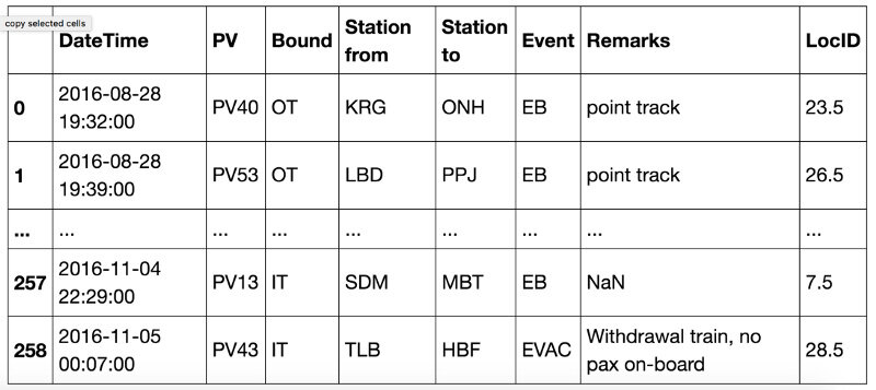
这就产生了如下表格:
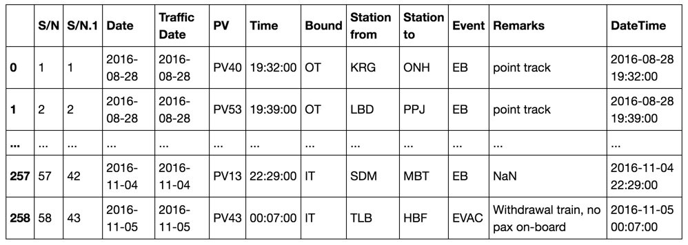
截图 1:初始处理的输出
最初的可视化没有明确的答案
我们在初步探索性的分析中找不到任何明显的答案,如下图所示:
1. 事件发生在一天之中,整天的事件数量反映了高峰和非高峰旅行时间。
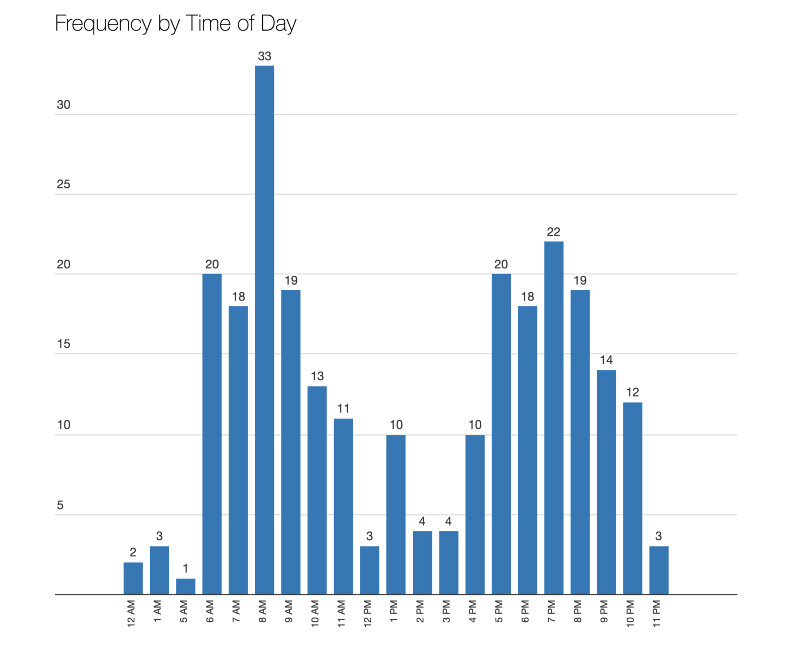
1 出现反映高峰和非高峰旅行时间的次数
2. 事故发生在环线上的各个地点,西侧发生的事件略多一些。
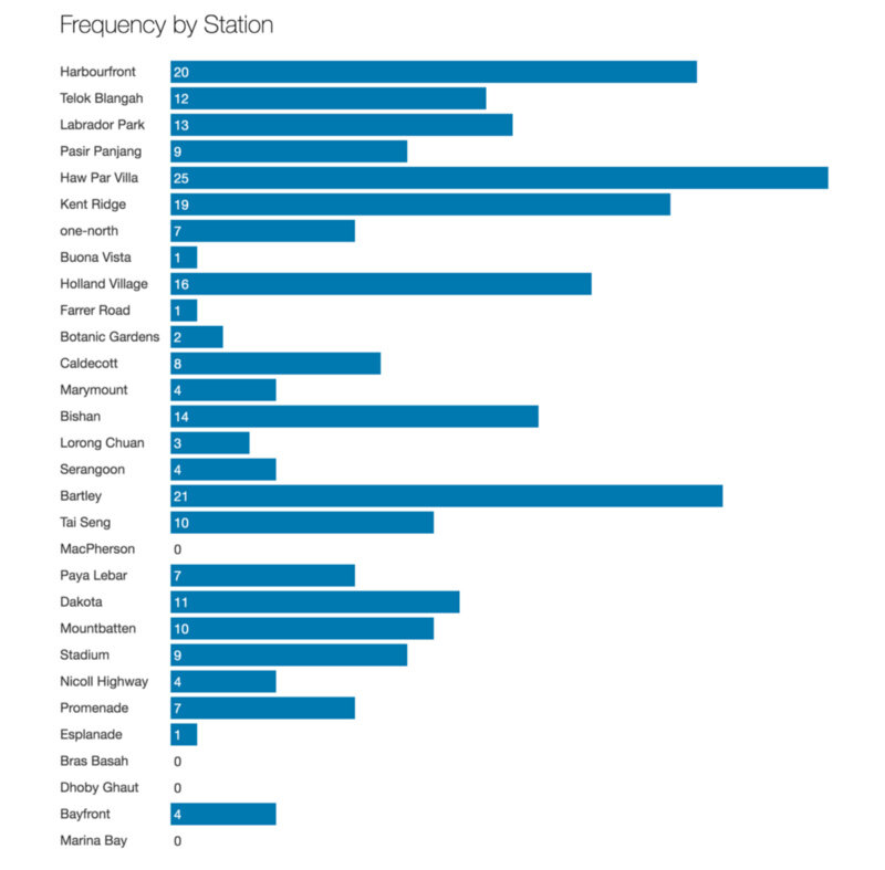
2 干扰的原因似乎与位置无关
3. 只有一辆或两辆列车的话,信号干扰并不会产生影响,但在这条环线上有许多列车。“PV”是“客运车辆”(Passenger Vehicle)的缩写。
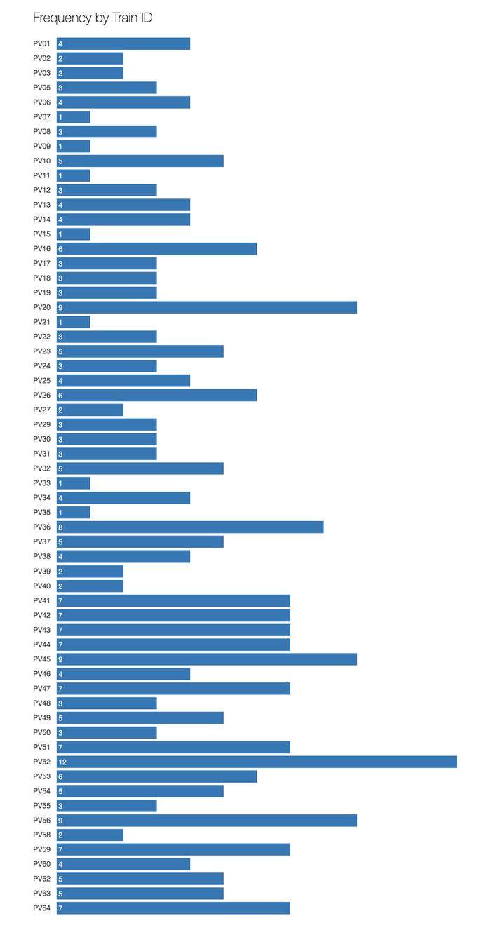
3 60 辆不同列车受到信号干扰
Marey 图表:显示时间、位置和方向
我们的下一步是将多维度纳入探索性分析。
我们的灵感来自 Marey 图表,这是 1983 年 Edward Tufte 出版的经典著作《定量信息的视觉显示》(《 The Visual Display of Quantitative Information 》)最近,它被 Mike Barry 和 Brian Card 应用在波士顿地铁系统的大规模可视化项目:
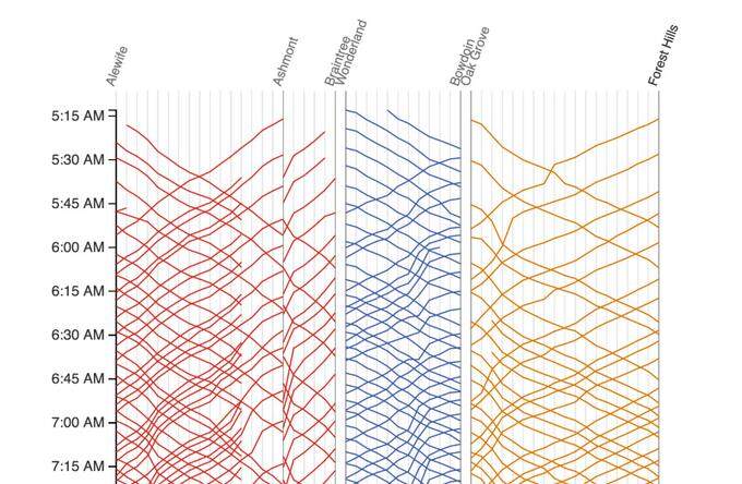
截图2 摘自http://mbtaviz.github.io/
在该图表中,垂直轴表示时间——按时间顺序从上到下;而水平轴表示沿着列车线路的车站。对角线则表示列车运行。
在我们的Marey 图表中开始绘制轴:
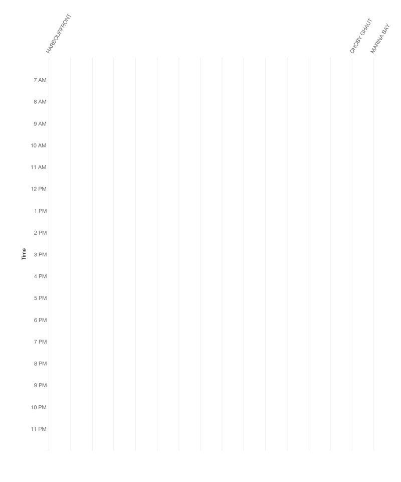
4 环线版本的一个空白 Marey 图表
在正常情况下,在 HarbourFront 和 Dhoby Ghaut 之间运行的列车将在类似与此的线路上移动,每次单程行程只需要一个小时以上:
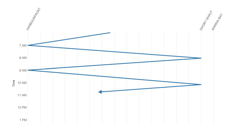
5 环线上列车运行的程式化表示
我们的目的是在这个图表上绘制事件——是点而不是线。
准备可视化数据
首先,我们将站名从三字母代码转换为数字:
- Marina Bay 到 Promenade 之前:0 到 1.5;
- Dhoby Ghaut 到 HarbourFront:2 到 29。
如果事故发生在两个站之间,则将其表示为 0.5 加上两个站号中的较小数。例如,如果事件发生在 HarbourFront(29)和 Telok Blangah(28)之间,则位置将是“28.5”。这样我们就很容易绘制沿水平轴的点。
stations=("MRB,BFT,DBG,BBS,EPN,PMN,NCH,SDM,MBT,DKT,PYL,MPS,TSG,BLY,SER,"
         "LRC,BSH,MRM,CDT,BTN,FRR,HLV,BNV,ONH,KRG,HPV,PPJ,LBD,TLB,HBF").split(',')

def loc_id(station1, station2 = None):
   """
   Translates a 3-letter station code to a number,
   or a pair of 3-letter station codes to a number.
   Single stations are represented as whole numbers.
   Locations between stations are represented with a .5.

   Example:
   loc_id('MRB')         # 0 (Marina Bay)
   loc_id('MRB', 'BFT')  # 0.5 (Between Marina Bay and Bayfront)
   loc_id('DBG')         # 2 (Dhoby Ghaut)
   loc_id('HBF')         # 29
   loc_id('HBF', 'TLB')  # 28.5 (Between Harbourfront and Telok Blangah)
   loc_id('HBF', 'DBG')  # throws and error, because these stations are not adjacent
   """
   if station2 == None or station2 == 'nan' or (type(station2) is float and math.isnan(station2)):
       # Single stations
       return stations.index(station1)

   else: # Pairs of stations -- take the average to get the 0.5
       stn1_index = stations.index(station1)
       stn2_index = stations.index(station2)

       # Handle the branch at Promenade
       if (set(['PMN', 'EPN']) == set([station1, station2])):
           return float(stations.index('EPN')) + 0.5
       elif set(['PMN', 'BFT']) == set([station1, station2]):
           return float(stations.index('BFT')) + 0.5
       else:
           # Require station pairs to be adjacent stations
           assert(math.fabs(stn1_index - stn2_index) == 1)
           return float(stn1_index + stn2_index) / 2
片段 4
然后我们计算位置 ID 的数字……
def loc_id_from_stations(row):
   try:
       # This handles entries with both "Station from" and "Station to"
       # and entries with only "Station from"
       return loc_id(row['Station from'], str(row['Station to']))
   except ValueError:
       # Some entries only have "Station to" but no
       # "Station from"
       return loc_id(row['Station to'])
片段 5
并添加到数据集:
# Select only some columns that we are interested in
sel_dfincidents = dfincidents[['DateTime', 'PV', 'Bound', 'Station from', 'Station to', 'Event', 'Remarks']]

# Add the location ID into the dataset
sel_dfincidents['LocID'] = sel_dfincidents.apply(loc_id_from_stations, axis=1)
片段 6
然后我们得到如下表格:
截图 3 添加位置 ID 后的输出表
通过数据处理,我们能够创建所有紧急制动事件的散点图。这里的每个点代表一个事件。我们还是无法发现任何明显的事故模式。
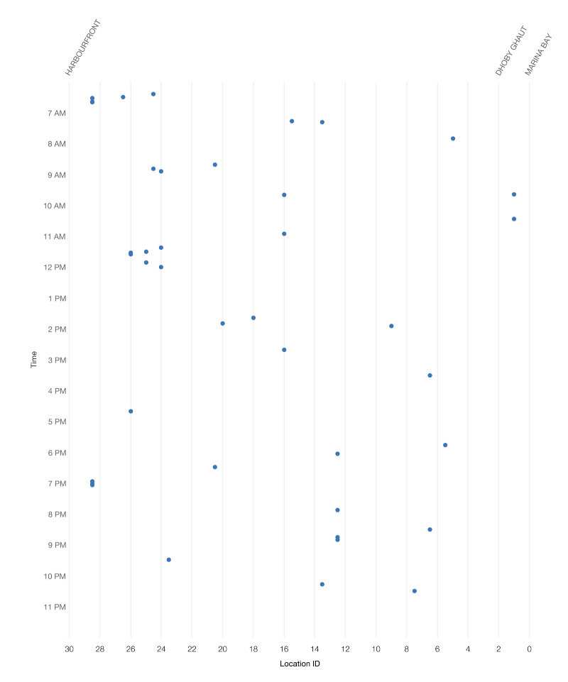
6 信号干扰事件表示为散点图
接下来,我们通过将每个事件表示为指向左侧或右侧的三角形,而不是点,将列车方向添加到图表中:
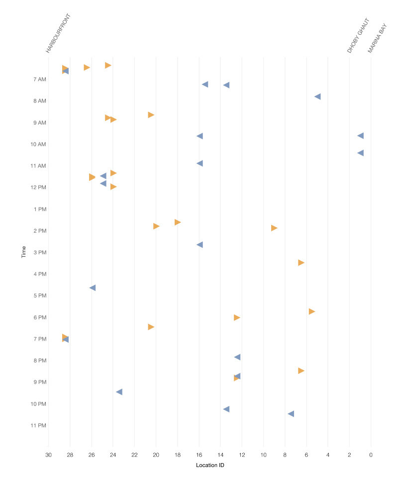
7 方向由箭头和颜色表示。
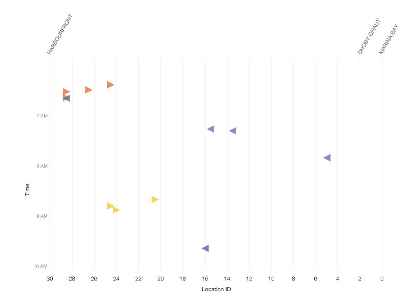
它看起来相当随机,但当我们放大到如下的图表,一个模式似乎似乎浮出了水面:
8 上午 6 点到 10 点之间的事件
如果你仔细阅读图表,你会注意到,故障似乎按顺序发生。当一趟列车受到干扰时,另一趟在同一方向行驶的列车很快就会受到波及。
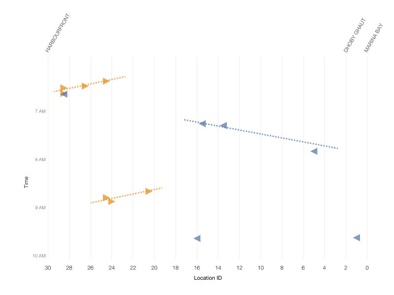
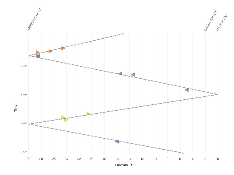
信号如何互相干扰?
在这一点上依然不明,一趟列车是罪魁祸首。
我们已经证实的是,似乎有一个随时间和位置相关的模式:事件一个接一个地发生,与上一个事件的方向相反。似乎有一条“破坏的痕迹”,它会不会是导致数据集中那些事件的诱因?
事实上,连接事件的假想线看上去与截图 2 的 Marey 图表可疑地类似。干扰的原因会不会是对面轨道的列车?
9 它会是一趟相反方向行驶的列车吗?
我们决定检验这个“反常列车”的假说。
我们已经知道,沿着环线的车站之间的行驶时间在两到四分钟之间。这意味着如果发生 4 分钟的间隔,我们可以将所有紧急制动事件分组在一起。
def same_cascade(i, j):
   """
   Given a pair of incidents (i,j), returns true if:

       t <= d * 4 mins

   where t is  the time difference between occurrences
   and d is the distance (measured by difference in location ID).

   Moreover, we consider the track direction, and only consider
   incidents that are "moving backwards".
   """

   # If trains are not travelling in the same direction
   # they cannot be due to the same "backward moving" interference
   # source.
   # (Note: This was the hypothesis when this code was written.
   # It turned out that the rogue train could affect all
   # trains in the vicinity, not just in the opposite track)
   if i["Bound"] != j["Bound"] or \
       i["Bound"] not in ['IT', 'OT']:
       return False

   # time difference in minutes
   time_difference = (i["DateTime"] - j["DateTime"]) / np.timedelta64(1, 'm')
   location_difference = i["LocID"] - j["LocID"]

   if location_difference == 0:
       return False

   ratio = time_difference / location_difference

   if i["Bound"] == 'OT':
       return ratio > 0 and ratio < 4
   elif i["Bound"] == 'IT':
       return ratio < 0 and ratio > -4
片段 7
我们发现了满足这个条件的所有事件对:
incidents = sel_dfincidents.to_records()
# (a, b, c, d, ...) --> ((a,b), (a,c), (a,d), ..., (b,c), (b,d), ..., (c,d), ...)
incident_pairs = list(it.combinations(incidents, 2))

related_pairs = [ip for ip in incident_pairs if same_cascade(*ip)]
related_pairs = [(i[0], j[0]) for i,j in related_pairs]
片段 8
然后,我们使用并查集的数据结构将所有相关的事件对分组成更大的集合。这使我们可以将可能关联到同一“反常列车”的事件分组。
def pairs_to_clusters(pairs):
   """
   A quick-and-dirty disjoint-set data structure. But this works fast enough for 200+ records
   Could be better.

   Example input:
   (1,2), (2,3), (4,5)

   Output:
   1: {1,2,3}
   2: {1,2,3}
   3: {1,2,3}
   4: {4,5}
   5: {4,5}
   """
   the_clusters = dict()

   for i,j in pairs:
       if i not in the_clusters:
           if j in the_clusters:
               the_clusters[j].add(i)
               the_clusters[i] = the_clusters[j]
           else:
               the_clusters[i] = set(list([i, j]))
               the_clusters[j] = the_clusters[i]
       else:
           if j in the_clusters:
               if the_clusters[i] is not the_clusters[j]: # union the two sets
                   for k in the_clusters[j]:
                       the_clusters[i].add(k)
                       the_clusters[k] = the_clusters[i]
               else: # they are already in the same set
                   pass
           else:
               the_clusters[i].add(j)
               the_clusters[j] = the_clusters[i]

   return the_clusters
片段 9
然后将我们的算法应用于数据:
clusters = pairs_to_clusters(related_pairs)
# Show each set only once
clusters = [v for k,v in clusters.items() if min(v) == k]
clusters[0:10]
片段 10
这些是我们确定的一些集群:
[{0, 1},
{2, 4},
{5, 6, 7},
{8, 9},
{18, 19, 20},
{21, 22, 24, 26, 27},
{28, 29, 30, 31, 32, 33, 34},
{42, 44, 45},
{47, 48},
{51, 52, 53, 56}]
接下来,我们计算了可以通过我们的聚类算法解释的事件的百分比。
# count % of incidents occurring in a cluster
all_clustered_incidents = set()

for i,clust in enumerate(clusters):
   all_clustered_incidents |= clust

(len(all_clustered_incidents),
len(incidents),
float(len(all_clustered_incidents)) / len(incidents))
片段 11
结果是:
(189, 259, 0.7297297297297297)
它表达的意思是:在数据集中的 259 个紧急制动事件中,189 个案例(其中 73 个)可以通过“反常列车”假说来解释。我们觉得我们真的走对了路。
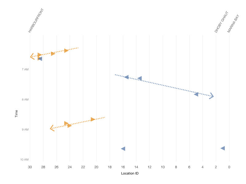
我们基于聚类结果对事件图进行了着色。具有相同颜色的三角形在同一个集群中。
10 通过我们的算法聚类的事件
有多少反常列车?
如图 5所示,在环线上的每个端到端行程需要大约 1 小时。我们通过事件图和与图 5密切匹配的线绘制最佳线。这强烈暗示只有一个“反常列车”。
11 事件集群的时间强烈暗示干扰能够关联到单趟列车
我们还观察到,不明的“反常列车”本身似乎没有遇到任何信号问题,因为它没有出现在我们的散点图。
我们相信我们有一个很好的例子,决定进一步调查。
捕获反常列车
日落之后,我们去了 Kim Chuan 站以确定“反常列车”。我们不能检查详细的列车日志,因为 SMRT 需要更多的时间来提取数据。因此,我们决定用传统方式通过查看在事件发生时到达和离开每个车站的列车的视频记录来识别列车。
上午 3 点,车队出现了头号嫌犯:PV46,一辆自 2015 年起投入使用的列车。
检验假说
11 月 6 日(星期日),LTA 和 SMRT 测试,如果 PV46 是通过运行列车在非高峰时间问题的来源,那我们就对了——PV46 确实导致了附近列车之间的通信丢失,并触发那些列车上的紧急制动器。在 PV46 未投入使用的那天之前,并没有这样的事件发生。
在 11 月 7 日(星期一),我们的团队处理了 PV46 的历史位置数据,并得出结论,从 8 月到 11 月的所有事件中,超过 95% 可以用我们的假说来解释。其余的事件,可能是由于偶发在正常情况下的信号丢失。
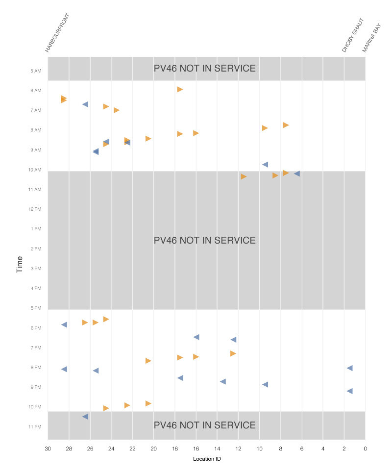
在某些日子,如 9 月 1 日,这种模式特别明显。你可以很容易地看到,当 PV46 投入运行时 ,在其运行期间或者前后,常常发生发生干扰事件。
LTA 和 SMRT 最终于 11 月 11 日发布了一份联合新闻稿,与公众分享调查结果。
小结
当我们开始时,我们曾经希望能够找到跨机构调查组可能感兴趣的模式,其中包括 LTA、SMRT 和 DSTA 的许多官员。SMRT 和 LTA 提供的整洁的事件日志帮助我们开了一个好头,因为在导入和分析数据之前需要尽可能少的清理。我们还对 LTA 和 DSTA 的有效跟踪调查表示满意,因为他们证实了 PV46 存在硬件问题。
从数据科学的角度来看,我们很幸运,事件发生得如此接近。这使我们能够在如此短的时间内识别问题和罪魁祸首。如果事件更加孤立,则 Z 字形模式将不那么明显,并且它将让我们耗费更多的时间和数据来解决这个谜。
当然,令人最高兴的是,现在所有人可以坐环线地铁再次充满信心地工作。
注意:本文提到的代码是在 2016 年 11 月 5 日编写的——我们处理 SMRT 数据以确定环线地铁事件原因的实际日期。我们承认可能存在不足之处。您可以在这里下载我们的Jupyter Notebook 的副本。
关注Data.gov.sg: Twitter | Facebook
感谢杜小芳对本文的审校。
给InfoQ 中文站投稿或者参与内容翻译工作,请邮件至 editors@cn.infoq.com 。也欢迎大家通过新浪微博( @InfoQ , @丁晓昀),微信(微信号: InfoQChina )关注我们。


