
大家讨论在 Vue.js 中创建 UI 组件时,总会提到可复用性的问题。没错,Vue.js 的一大核心原则就是其基于组件的架构,相应的好处自然是有助于可复用性和模块化。但这俩时髦词汇到底该怎么理解?
假设我们创建了一个可复用的组件:
那我或我的同事真能在系统的其他部分复用这个组件吗?
面对新需求,我们可能还得修改这个“可复用组件”。
如果需要拆分这个“可复用组件”,以便把拆分出来的新组件应用到其他位置,又该如何操作?
在 Vue.js 中创建可复用组件的具体过程其实颇为棘手。在本文中,我们将具体探讨可复用组件的概念、实际应用时面临的问题,以及为什么有必要花心思克服这一道道难关。
可复用组件是个啥?
可复用组件是指一个个 UI 构建块,它们能在应用程序的各个位置、甚至是不同应用的相应位置上发挥作用。它们封装有特定的功能或 UI 模式,能够轻松集成至应用程序的其他部分,而且无需进行重大修改。
可复用组件的优势
通过在 Vue.js 中使用可复用组件,我们可以获得以下好处。
提升效率:允许开发人员一次编写代码并多次重复使用,减少冗余内容并节约下宝贵的开发时间。
贯彻标准化:促进各 Vue.js 项目之间的一致性和标准化,确保整个应用程序当中贯彻相同的设计模式、样式与功能。
增强可扩展性:随着项目发展,我们可以轻松实现扩展和调整。通过将应用程序拆分成更小且可复用的组件,复杂功能的处理和新功能的添加也将变得更容易管理。
促进协作:有助于各 Vue.js 项目团队成员之间的协作。可复用组件将帮助每一位团队成员使用并理解相同的表达和 UI 元素集。
运用可复用概念时的三个关键问题
虽然 Vue.js 组件将可复用性作为一大原则特性,但以下几个现实问题却往往会阻碍其具体实现。
修改现有组件:第一个问题,就是需要修改应用程序中正在使用的现有组件。该组件可能需要进行调整,从而同时支持原有和新的需求。但对应用程序中其他部分组件进行变更,有可能带来意想不到的副作用并破坏其他位置上的功能。在变更需求与保持兼容性之间寻求平衡往往相当复杂。
在组件设计中考虑一致性和灵活性:第二个问题,就是如何在可复用组件的不同实例之间保持一致性,同时保留灵活的可定制空间。可复用组件应当具备充分的通用性,从而适应不同的设计要求和风格。当然,在不牺牲组件核心功能与一致性的情况下提供定制选项也绝非易事。
管理组件依赖项和状态:要想让可复用组件发挥作用,就必须管理好相关依赖项并保证各个组件独立且自包含。具体来讲,各组件不应紧密依赖于外部资源或应用程序的状态管理系统。只有这样,我们才能将可复用组件轻松整合至不同项目当中,减少引发冲突或意外副作用的可能性。
案例研究
比方说,客户想为内部员工创建一套目录系统。这个项目基于敏捷开发方法,在开发之前没法充分收集需求。项目进度共分为三个阶段(原型设计阶段、第一阶段和第二阶段),出于演示需要,下面我将重点关注其中的 Card 组件。
原型设计阶段
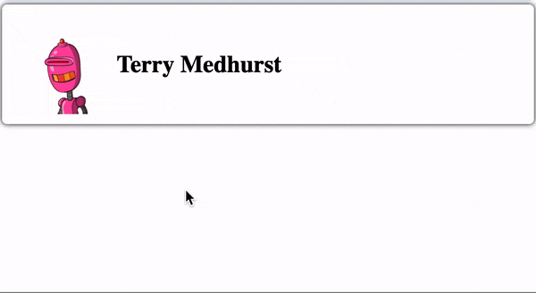
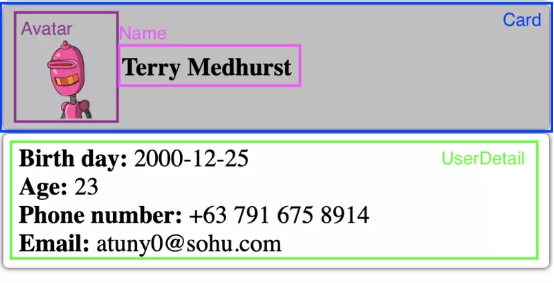
在原型设计阶段,我们需要提供一个 User Profile 用户资料页面。用户的个人资料将包含最基本的 User Card 组件,其中又分为 User Avatar 头像和 Name 姓名。
// Prototype.vue<script setup lang="ts"> import { defineProps, computed, Teleport, ref } from "vue"; interface Props { firstName: string; lastName: string; image?: string; } const props = defineProps<Props>();</script><template> <div class="app-card"> <img class="user-image" :src="image" alt="avatar" /> <div> <div> <label> {{ firstName }} {{ lastName }} </label> </div> </div> </div></template><style scoped> .app-card { padding-left: 10px; padding-right: 10px; padding-top: 5px; padding-bottom: 5px; background: white; box-shadow: 0 0 5px; border-radius: 5px; border: none; font-size: 1.5em; transition: 0.3s; display: flex; align-items: center; } .app-card label { font-weight: 600; } .app-card:hover { background: rgba(128, 128, 128, 0.5); } .user-image { width: 100px; }</style>第一阶段
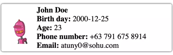
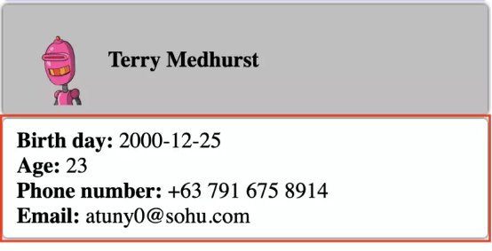
在第一阶段,客户那边希望能在 User Card 组件上添加 User Detail 客户细节(包括出生日期、年龄、手机号码和邮箱地址)。
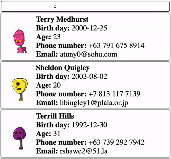
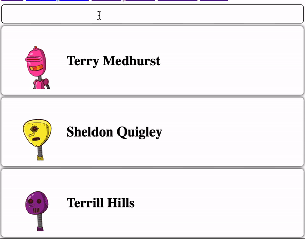
//Phase1.vue<script setup lang="ts"> import { defineProps, computed } from "vue"; interface Props { firstName: string; lastName: string; image?: string; birthDay?: string; phone?: string; email?: string; } const props = defineProps<Props>(); const age = computed(() => { if (!props.birthDay) { return "0"; } const birthYear = new Date(props.birthDay).getFullYear(); const currentYear = new Date().getFullYear(); return currentYear - birthYear; });</script><template> <div ref="cardRef" class="app-card"> <img class="user-image" :src="image" alt="avatar" /> <div> <div> <label> {{ firstName }} {{ lastName }} </label> </div> <div> <div> <label> Birth day: </label> <span> {{ birthDay }} </span> </div> <div> <label> Age: </label> <span> {{ age }} </span> </div> <div> <label> Phone number: </label> <span> {{ phone }} </span> </div> <div> <label> Email: </label> <span> {{ email }} </span> </div> </div> </div> </div></template><style scoped> .app-card { padding-left: 10px; padding-right: 10px; padding-top: 5px; padding-bottom: 5px; background: white; box-shadow: 0 0 5px; border-radius: 5px; border: none; font-size: 1.5em; transition: 0.3s; display: flex; align-items: center; } .app-card label { font-weight: 600; } .app-card:hover { background: rgba(128, 128, 128, 0.5); color: black; } .user-image { width: 100px; }</style>此外,客户还希望添加 Employee Directory 员工目录页面,其中以卡片格式显示用户资料。
// SearchPage<template> <div> <SearchInput v-model:value="searchValue" /> <template :key="item.id" v-for="item of list"> <div style="margin-bottom: 5px; margin-top: 5px"> <UserCard v-bind="item" /> </div> </template> </div></template><script lang="ts"> import SearchInput from "../components/SearchInput.vue"; import UserCard from "../components/Phase1.vue"; import { ref, watch } from "vue"; export default { name: "Search", components: { SearchInput, UserCard, }, setup() { const searchValue = ref<string>(); const list = ref(); fetch("https://dummyjson.com/users") .then((res) => res.json()) .then((res) => (list.value = res.users)); watch(searchValue, (v) => { fetch(`https://dummyjson.com/users/search?q=${v}`) .then((res) => res.json()) .then((res) => (list.value = res.users)); }); watch(list, (v) => console.log(v)); return { searchValue, list, }; }, };</script> 在此阶段,User Card 组件在两个页面上均可复用。
第二阶段
用户反馈称,员工目录页面过于混乱,大量信息导致阅读起来非常难受。因此,客户希望在鼠标悬停时通过提示来展现用户资料。而 User Setting 用户设置页面部分的内容则比较合理,可以不加变动。
// Phase 2<script setup lang="ts">import { defineProps, computed, Teleport, ref, onMounted, onBeforeUnmount,} from "vue";interface Props { firstName: string; lastName: string; image?: string; birthDate?: string; phone?: string; email?: string; address?: string;}const props = defineProps<Props>();const targetRef = ref<HTMLDiveElement>();const isMouseOver = ref(false);const dropdownRef = ref<HTMLDivElement>();const dropdownStyle = ref({});// add modal element in body to prevent overflow issueconst modalElement = document.createElement("div");modalElement.id = "modal";document.body.appendChild(modalElement);const age = computed(() => { if (!props.birthDate) { return "0"; } const birthYear = new Date(props.birthDate).getFullYear(); const currentYear = new Date().getFullYear(); return currentYear - birthYear;});const onMouseOver = () => { if (isMouseOver.value) { return; } isMouseOver.value = true; const dimension = targetRef.value.getBoundingClientRect(); dropdownStyle.value = { width: `${dimension.width}px`, left: `${dimension.x}px`, top: `${window.scrollY + dimension.y + dimension.height + 5}px`, };};const onMouseLeave = () => { isMouseOver.value = false;};</script><template> <div ref="targetRef" @mouseover="onMouseOver" @mouseleave="onMouseLeave" class="app-card" > <img class="user-image" :src="image" alt="avatar" /> <div> <div> <label> {{ firstName }} {{ lastName }} </label> </div> </div> </div> <Teleport to="#modal"> <div ref="dropdownRef" :style="dropdownStyle" style="position: absolute" v-show="isMouseOver" > <div class="app-card"> <div> <div> <label> Birth day: </label> <span> {{ birthDate }} </span> </div> <div> <label> Age: </label> <span> {{ age }} </span> </div> <div> <label> Phone number: </label> <span> {{ phone }} </span> </div> <div> <label> Email: </label> <span> {{ email }} </span> </div> </div> </div> </div> </Teleport></template><style scoped>.app-card { padding-left: 10px; padding-right: 10px; padding-top: 5px; padding-bottom: 5px; background: white; box-shadow: 0 0 5px; border-radius: 5px; border: none; font-size: 1.5em; transition: 0.3s; display: flex; align-items: center;}.app-card label { font-weight: 600;}.app-card:hover { background: rgba(128, 128, 128, 0.5); color: black;}.user-image { width: 100px;}</style>感兴趣的朋友可以通过实时演示,查看原型设计阶段、第一阶段和第二阶段的代码。
https://codesandbox.io/s/reusable-components-in-vue-wwsd5y?file=/src/components/Prototype.vue
这个新要求着实令人头痛:
我们要不要修改现有 User Card 组件来支持弹出提示?但这可能会影响到 User Setting 页面中的 User Card 组件,给应用程序造成意外干扰;
或者,我们可以直接复制现有 User Card 组件,再向其中添加弹出提示?但这意味着 User Card 组件将不可复用。

因为我们实在不想破坏已经能够正常起效的东西,所以这里更倾向于后一种选择。这乍看之下似乎是个完美的解决方案,但在大规模、长期运行的项目当中,却也有可能带来巨大的破坏性影响:
代码库膨胀:这种方式会令代码库变得越来越大,因为对组件的每次复制都会增加不必要的代码行。这将使得项目愈发难以维护,因为每当需要更新或者做 bug 修复时,开发人员都得在多个位置上进行更改。这样还增加了引发一致性冲突的可能性。
短期收益,长期痛苦:短期之内,这似乎是个快速且简单的解决方案,能很好地应对紧迫的时间期限或者急切的突发需求。但随着项目的发展,对大量重复组件的维护会变得越来越困难且耗时。对重复组件的修改或更新都将需要在多个实例之间反复进行,大大拉高产生错误的几率。
影响系统性能:这种方式会对系统性能产生负面影响。冗余代码会增加应用程序的体积,导致渲染时间变长并增加内存占用量。最终,这一切会致使用户体验不佳、降低系统运行效率。
如何克服上述难题
请做好心理准备,可复用组件在整个项目周期中往往需要适应和调整,很难长时间保持不变。这看似是句废话,但如果认真想想,大家就会发现这真的是句至理名言——因为需求在变,所以围绕需求建立的整个体系都必须得变。当然,丰富的经验能帮助大家在初步设计时留出更大的适应空间,但也会相应影响开发速度。
重构可复用组件
就个人经验来讲,我更倾向于重新设计和重构这些可复用组件。所谓重构,就是在不改变其原始功能的情况下对代码做重新整理。可以选择的重构方法有很多,我个人会将组件重构并拆分成更多小型组件。这些更小的组件能在整个系统中灵活发挥作用。有了这个基本思路,下面来看我们要如何具体解决前文案例中提出的问题。
请注意:重构 UI 组件也需要遵守一定原则。另外,重构可能也会面临挑战,特别是如何在项目交付期限和代码清晰度之间取得平衡。
尝试解决前文案例
首先,我们将现有 User Card 组件拆分成 4 个组件:
Card 卡片组件
Avatar 头像组件
Name 姓名组件
User Detail 用户资料组件
// Card.vue<template> <div class="app-card"> <slot></slot> </div></template><style scoped> .app-card { padding-left: 15px; padding-right: 15px; padding-top: 10px; padding-bottom: 10px; border-radius: 5px; border: none; background: white; color: black; font-size: 1.5em; transition: 0.3s; display: flex; align-items: center; box-shadow: 0 0 5px; } .app-card:hover { background: rgba(128, 128, 128, 0.5); color: black; }</style>// Avatar.vue<script setup lang="ts"> import { defineProps } from "vue"; interface Props { image: string; } const props = defineProps<Props>();</script><template> <img class="user-image" :src="image" alt="avatar" /></template><style scoped> .user-image { width: 100px; }</style>// UserName.vue<script setup lang="ts"> import { defineProps } from "vue"; interface Props { firstName: string; lastName: string; } const props = defineProps<Props>();</script><template> <label> {{ firstName }} {{ lastName }} </label></template>// Description Item<script setup lang="ts"> import { defineProps } from "vue"; interface Props { label: string; value: string | number; } const props = defineProps<Props>();</script><template> <div> <label> {{ label }}: </label> <span> {{ value }} </span> </div></template><style scoped> label { font-weight: 600; }</style>// UserDescription.vue<script setup lang="ts"> import DescriptionItem from "./DescriptionItem.vue"; import { defineProps, computed } from "vue"; interface Props { birthDate: string; phone: string; email: string; } const props = defineProps<Props>(); const age = computed(() => { if (!props.birthDate) { return "0"; } const birthYear = new Date(props.birthDate).getFullYear(); const currentYear = new Date().getFullYear(); return currentYear - birthYear; });</script><template> <div> <DescriptionItem label="Birth day" :value="birthDate" /> <DescriptionItem label="Age" :value="age" /> <DescriptionItem label="Phone number" :value="phone" /> <DescriptionItem label="Email" :value="email" /> </div></template>接下来,我会创建一个 tooltip 弹出提示组件。将其设定为独立组件之后,我也可以在系统的其他位置对它进行复用。
// Tooltip.vue<script setup lang="ts">import { Teleport, computed, ref, onMounted, onBeforeUnmount, watch,} from "vue";const isMouseOver = ref(false);const targetRef = ref<HTMLDivElement>();const dropdownStyle = ref({});const dropdownRef = ref<HTMLDivElement>();const existModalElement = document.getElementById("modal");if (!existModalElement) { // add modal element in body to prevent overflow issue const modalElement = document.createElement("div"); modalElement.id = "modal"; document.body.appendChild(modalElement);}const onMouseOver = () => { if (isMouseOver.value) { return; } isMouseOver.value = true; const dimension = targetRef.value.getBoundingClientRect(); dropdownStyle.value = { width: `${dimension.width}px`, left: `${dimension.x}px`, top: `${window.scrollY + dimension.y + dimension.height + 5}px`, };};const onMouseLeave = () => { isMouseOver.value = false;};</script><template> <div @mouseover="onMouseOver" @mouseleave="onMouseLeave" ref="targetRef"> <slot name="default" /> </div> <Teleport to="#modal"> <div ref="dropdownRef" :style="dropdownStyle" style="position: absolute" v-show="isMouseOver" > <Card> <slot name="overlay" /> </Card> </div> </Teleport></template>最后,我把这些组件整合起来,如下所示。在其中的 User Setting 用户设置页面中,我会使用 User Card 组件,其中包含 Card、Avatar、Name 和 User Detail 组件。
// UserWithDescription.vue<script setup lang="ts">import AppCard from "./Card.vue";import DescriptionItem from "./DescriptionItem.vue";import Avatar from "./Avatar.vue";import UserName from "./UserName.vue";import UserDescription from "./UserDescription.vue";import { defineProps } from "vue";interface Props { firstName: string; lastName: string; image?: string; birthDate?: string; phone?: string; email?: string; address?: string;}const props = defineProps<Props>();</script><template> <AppCard> <Avatar :image="image" /> <div> <div> <UserName :firstName="firstName" :lastName="lastName" /> </div> <UserDescription v-bind="props" /> </div> </AppCard></template>至于 Employee Directory 员工目录页面,我打算使用 2 个组合组件:
其中的基本 User Card 组件由 Card、Avatar 和 Name 组件构成。
User Tooltip 弹出提示组件则由 Card、Tooltip 和 User Detail 组件构成。
// UserCard.vue<script setup lang="ts"> import AppCard from "./Card.vue"; import DescriptionItem from "./DescriptionItem.vue"; import Avatar from "./Avatar.vue"; import UserName from "./UserName.vue"; import { defineProps } from "vue"; interface Props { firstName: string; lastName: string; image?: string; } const props = defineProps<Props>();</script><template> <AppCard> <Avatar :image="image" /> <div> <div> <UserName :firstName="firstName" :lastName="lastName" /> </div> </div> </AppCard></template>// UserCardWithTooltip.vue<script setup lang="ts"> import ToolTip from "./Tooltip.vue"; import UserDescription from "./UserDescription.vue"; import UserCard from "./UserCard.vue"; import Card from "./Card.vue"; import { defineProps } from "vue"; interface Props { firstName: string; lastName: string; image?: string; birthDate?: string; phone?: string; email?: string; } const props = defineProps<Props>();</script><template> <ToolTip> <UserCard v-bind="props" /> <template #overlay> <Card> <UserDescription v-bind="props" /> </Card> </template> </ToolTip></template>关于本案例中代码重构的更多细节信息,请参阅我分享的完整解决方案:
请注意:很多朋友可能发现,我提供的解决方案基于原子设计思路。这个概念本身就能最大限度缓解“可复用”方面的挑战。如果您对 Vue.js 中的原子设计思维感兴趣,这里向大家推荐另外一篇文章:
https://dev.to/berryjam/introducing-atomic-design-in-vuejs-1l2h
单元测试能帮上忙吗?
很多朋友可能觉得,为那些可复用组件编写单元测试应该能帮得上忙。毕竟在全面覆盖之后,单元测试有助于保证针对各组件的修改和增强不会意外破坏其原有功能。
但这里要给大家泼点冷水,单元测试本身并不会让组件变得更可复用,而只是让组件更加健壮。而且根据任务中的特定部分将组件进一步拆解,倒是可以让单元测试变得更易于编写和管理。
总结
受到修改现有组件、保持一致性、管理依赖项和系统状态等一系列现实问题的影响,在 Vue.js 中实际构建可复用组件往往充满挑战。但考虑到可复用组件所带来的种种助益,我们当然有理由迎难而上、努力克服这些障碍。可复用组件能够增强代码组织结构、提高开发效率,也有助于建立起更趋一致的用户界面。面对新的任务或者要求,我们不妨从设计可复用组件入手,从当下开始改善整个项目的结构和质量。
欢迎评论区说出你的建议。