宽度单位和像素密度
react 的宽度不支持百分比,设置宽度时不需要带单位 {width: 10}, 那么 10 代表的具体宽度是多少呢?
不知道是官网文档不全还是我眼瞎,反正是没找到,那做一个实验自己找吧:
   var Dimensions = require('Dimensions');
   <Text style={styles.welcome}>
         window.width={Dimensions.get('window').width + '\n'}
         window.height={Dimensions.get('window').height + '\n'}
         pxielRatio={PixelRatio.get()}
   </Text>
默认用的是 iphone6 的模拟器结果是:
   window.width=375
   window.height=667
   pxielRatio=2
我们知道 iphone 系列的尺寸如下图:
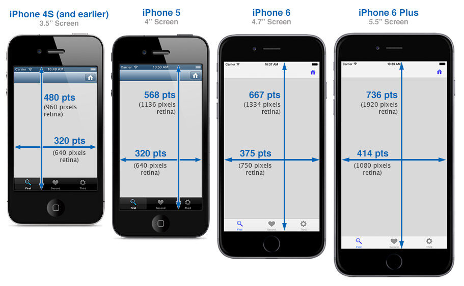
可以看到 iphone 6 的宽度为 375pt,对应了上边的 375,由此可见 react 的单位为 pt。 那如何获取实际的像素尺寸呢? 这对图片的高清化很重要,如果我的图片大小为 100*100 px. 设置宽度为 100 * 100. 那在 iphone 上的尺寸就是模糊的。 这个时候需要的图像大小应该是 100 * pixelRatio 的大小 。
react 提供了 PixelRatio 的获取方式 https://facebook.github.io/react-native/docs/pixelratio.html
var image = getImage({
  width: 200 * PixelRatio.get(),
  height: 100 * PixelRatio.get()
});
<Image source={image} style={{width: 200, height: 100}} />
flex 的布局
默认宽度
我们知道一个 div 如果不设置宽度,默认的会占用 100% 的宽度, 为了验证 100% 这个问题, 做三个实验
- 根节点上方一个 View, 不设置宽度
- 固定宽度的元素上设置一个 View, 不设置宽度
- flex 的元素上放一个 View 宽度, 不设置宽度
 <Text style={[styles.text, styles.header]}>
      根节点上放一个元素,不设置宽度
  </Text>

  <View style={{height: 20, backgroundColor: '#333333'}} />

  <Text style={[styles.text, styles.header]}>
      固定宽度的元素上放一个 View,不设置宽度
  </Text>

  <View style={{width: 100}}>
    <View style={{height: 20, backgroundColor: '#333333'}} />
  </View>

  <Text style={[styles.text, styles.header]}>
      flex 的元素上放一个 View,不设置宽度
  </Text>

  <View style={{flexDirection: 'row'}}>
    <View style={{flex: 1}}>
      <View style={{height: 20, backgroundColor: '#333333'}} />
    </View>
    <View style={{flex: 1}}/>
  </View>
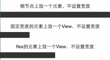
结果可以看到 flex 的元素如果不设置宽度, 都会百分之百的占满父容器。
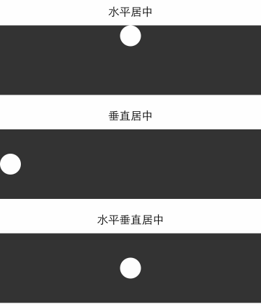
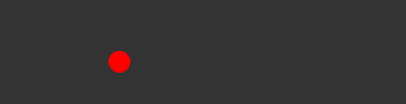
水平垂直居中
css 里边经常会做的事情是去讲一个文本或者图片水平垂直居中,如果使用过 css 的 flexbox 当然知道使用alignItems 和 justifyContent . 那用 react-native 也来做一下实验
  <Text style={[styles.text, styles.header]}>
       水平居中
   </Text>

   <View style={{height: 100, backgroundColor: '#333333', alignItems: 'center'}}>
     <View style={{backgroundColor: '#fefefe', width: 30, height: 30, borderRadius: 15}}/>
   </View>

    <Text style={[styles.text, styles.header]}>
       垂直居中
   </Text>
   <View style={{height: 100, backgroundColor: '#333333', justifyContent: 'center'}}>
     <View style={{backgroundColor: '#fefefe', width: 30, height: 30, borderRadius: 15}}/>
   </View>

   <Text style={[styles.text, styles.header]}>
       水平垂直居中
   </Text>
   <View style={{height: 100, backgroundColor: '#333333', alignItems: 'center', justifyContent: 'center'}}>
     <View style={{backgroundColor: '#fefefe', width: 30, height: 30, borderRadius: 15}}/>
   </View>
网格布局
网格布局实验, 网格布局能够满足绝大多数的日常开发需求,所以只要满足网格布局的 spec,那么就可以证明 react 的 flex 布局能够满足正常开发需求
等分的网格
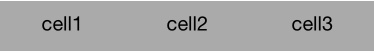
   <View style={styles.flexContainer}>
     <View style={styles.cell}>
       <Text style={styles.welcome}>
         cell1
       </Text>
     </View>
     <View style={styles.cell}>
       <Text style={styles.welcome}>
         cell2
       </Text>
     </View>
     <View style={styles.cell}>
       <Text style={styles.welcome}>
         cell3
       </Text>
     </View>
   </View>

   styles = {
       flexContainer: {
           // 容器需要添加 direction 才能变成让子元素 flex
           flexDirection: 'row'
       },
       cell: {
           flex: 1,
           height: 50,
           backgroundColor: '#aaaaaa'
       },
       welcome: {
           fontSize: 20,
           textAlign: 'center',
           margin: 10
       },
   }
左边固定, 右边固定,中间 flex 的布局
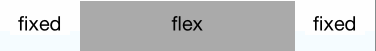
   <View style={styles.flexContainer}>
     <View style={styles.cellfixed}>
       <Text style={styles.welcome}>
         fixed
       </Text>
     </View>
     <View style={styles.cell}>
       <Text style={styles.welcome}>
         flex
       </Text>
     </View>
     <View style={styles.cellfixed}>
       <Text style={styles.welcome}>
         fixed
       </Text>
     </View>
   </View>

   styles = {
       flexContainer: {
           // 容器需要添加 direction 才能变成让子元素 flex
           flexDirection: 'row'
       },
       cell: {
           flex: 1,
           height: 50,
           backgroundColor: '#aaaaaa'
       },
       welcome: {
           fontSize: 20,
           textAlign: 'center',
           margin: 10
       },
       cellfixed: {
           height: 50,
           width: 80,
           backgroundColor: '#fefefe'
       }
   }
嵌套的网格
通常网格不是一层的,布局容器都是一层套一层的, 所以必须验证在real world下面的网格布局
<Text style={[styles.text, styles.header]}>
   嵌套的网格
 </Text>
 <View style={{flexDirection: 'row', height: 200, backgroundColor:"#fefefe", padding: 20}}>
   <View style={{flex: 1, flexDirection:'column', padding: 15, backgroundColor:"#eeeeee"}}>
       <View style={{flex: 1, backgroundColor:"#bbaaaa"}}>
       </View>
       <View style={{flex: 1, backgroundColor:"#aabbaa"}}>
       </View>
   </View>
   <View style={{flex: 1, padding: 15, flexDirection:'row', backgroundColor:"#eeeeee"}}>
       <View style={{flex: 1, backgroundColor:"#aaaabb"}}>
           <View style={{flex: 1, flexDirection:'row', backgroundColor:"#eeaaaa"}}>
              <View style={{flex: 1, backgroundColor:"#eebbaa"}}>
             </View>
             <View style={{flex: 1, backgroundColor:"#bbccee"}}>
             </View>
           </View>
           <View style={{flex: 1, backgroundColor:"#eebbdd"}}>
           </View>
       </View>
       <View style={{flex: 1, backgroundColor:"#aaccaa"}}>
         <ScrollView style={{flex: 1, backgroundColor:"#bbccdd", padding: 5}}>
               <View style={{flexDirection: 'row', height: 50, backgroundColor:"#fefefe"}}>
                 <View style={{flex: 1, flexDirection:'column', backgroundColor:"#eeeeee"}}>
                     <View style={{flex: 1, backgroundColor:"#bbaaaa"}}>
                     </View>
                     <View style={{flex: 1, backgroundColor:"#aabbaa"}}>
                     </View>
                 </View>
                 <View style={{flex: 1, flexDirection:'row', backgroundColor:"#eeeeee"}}>
                     <View style={{flex: 1, backgroundColor:"#aaaabb"}}>
                         <View style={{flex: 1, flexDirection:'row', backgroundColor:"#eeaaaa"}}>
                            <View style={{flex: 1, backgroundColor:"#eebbaa"}}>
                           </View>
                           <View style={{flex: 1, backgroundColor:"#bbccee"}}>
                           </View>
                         </View>
                         <View style={{flex: 1, backgroundColor:"#eebbdd"}}>
                         </View>
                     </View>
                     <View style={{flex: 1, backgroundColor:"#aaccaa"}}>
                     </View>
                 </View>
               </View>
               <Text style={[styles.text, styles.header, {color: '#ffffff', fontSize: 12}]}>
                 {(function(){
                   var str = '';
                   var n = 100;
                   while(n--) {
                     str += '嵌套的网格' + '\n';
                   }
                   return str;
                 })()}
               </Text>
         </ScrollView>
       </View>
   </View>
 </View>
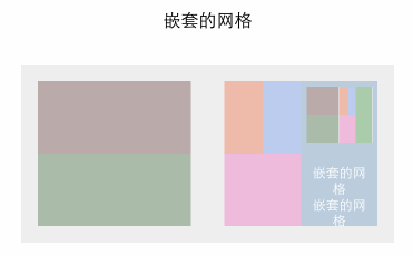
好在没被我玩儿坏,可以看到上图的嵌套关系也是足够的复杂的,(我还加了一个 ScrollView,然后再嵌套整个结构)嵌套多层的布局是没有问题的。
图片布局
首先我们得知道图片有一个 stretchMode. 通过 Image.resizeMode 访问
找出有哪些 mode
var keys = Object.keys(Image.resizeMode).join(' ');
打印出来的是 contain, cover, stretch 这几种模式, (官方文档不知道为什么不直接给出)
尝试使用这些 mode
 <Text style={styles.welcome}> 100px height </Text>
 <Image style={{height: 100}} source={{uri: 'http://gtms03.alicdn.com/tps/i3/TB1Kcs5GXXXXXbMXVXXutsrNFXX-608-370.png'}} />
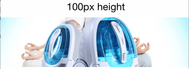
100px 高度, 可以看到图片适应 100 高度和全屏宽度,背景居中适应未拉伸但是被截断也就是 cover。
 <Text style={styles.welcome}> 100px height with resizeMode contain </Text>
 <View style={[{flex: 1, backgroundColor: '#fe0000'}]}>
     <Image style={{flex: 1, height: 100, resizeMode: Image.resizeMode.contain}} source={{uri: 'http://gtms03.alicdn.com/tps/i3/TB1Kcs5GXXXXXbMXVXXutsrNFXX-608-370.png'}} />
 </View>
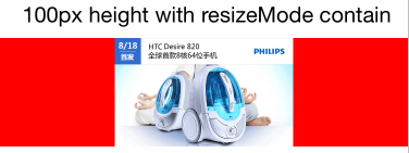
contain 模式容器完全容纳图片,图片自适应宽高
 <Text style={styles.welcome}> 100px height with resizeMode cover </Text>
 <View style={[{flex: 1, backgroundColor: '#fe0000'}]}>
     <Image style={{flex: 1, height: 100, resizeMode: Image.resizeMode.cover}} source={{uri: 'http://gtms03.alicdn.com/tps/i3/TB1Kcs5GXXXXXbMXVXXutsrNFXX-608-370.png'}} />
 </View>
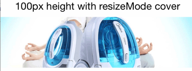
cover 模式同 100px 高度模式
 <Text style={styles.welcome}> 100px height with resizeMode stretch </Text>
 <View style={[{flex: 1, backgroundColor: '#fe0000'}]}>
     <Image style={{flex: 1, height: 100, resizeMode: Image.resizeMode.stretch}} source={{uri: 'http://gtms03.alicdn.com/tps/i3/TB1Kcs5GXXXXXbMXVXXutsrNFXX-608-370.png'}} />
 </View>
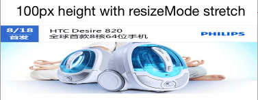
stretch 模式图片被拉伸适应屏幕
 <Text style={styles.welcome}> set height to image container </Text>
 <View style={[{flex: 1, backgroundColor: '#fe0000', height: 100}]}>
     <Image style={{flex: 1}} source={{uri: 'http://gtms03.alicdn.com/tps/i3/TB1Kcs5GXXXXXbMXVXXutsrNFXX-608-370.png'}} />
 </View>
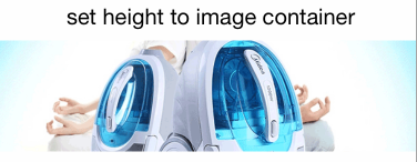
随便试验了一下, 发现高度设置到父容器,图片 flex 的时候也会等同于 cover 模式
绝对定位和相对定位
<View style={{flex: 1, height: 100, backgroundColor: '#333333'}}>
   <View style={[styles.circle, {position: 'absolute', top: 50, left: 180}]}>
   </View>
 </View>
 styles = {
   circle: {
   backgroundColor: '#fe0000',
   borderRadius: 10,
   width: 20,
   height: 20
   }
 }
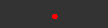
和 css 的标准不同的是, 元素容器不用设置position:'absolute|relative' .
<View style={{flex: 1, height: 100, backgroundColor: '#333333'}}>
   <View style={[styles.circle, {position: 'relative', top: 50, left: 50, marginLeft: 50}]}>
   </View>
 </View>
相对定位的可以看到很容易的配合 margin 做到了。 (我还担心不能配合 margin,所以测试了一下:-:)
padding 和 margin
我们知道在 css 中区分 inline 元素和 block 元素,既然 react-native 实现了一个超级小的 css subset。那我们就来实验一下 padding 和 margin 在 inline 和非 inline 元素上的 padding 和 margin 的使用情况。
*padding *
<Text style={[styles.text, styles.header]}>
   在正常的 View 上设置 padding
 </Text>

 <View style={{padding: 30, backgroundColor: '#333333'}}>
   <Text style={[styles.text, {color: '#fefefe'}]}> Text Element</Text>
 </View>

 <Text style={[styles.text, styles.header]}>
   在文本元素上设置 padding
 </Text>
 <View style={{padding: 0, backgroundColor: '#333333'}}>
   <Text style={[styles.text, {backgroundColor: '#fe0000', padding: 30}]}>
     text 元素上设置 paddinga
   </Text>
 </View>
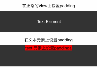
在 View 上设置 padding 很顺利,没有任何问题, 但是如果在 inline 元素上设置 padding, 发现会出现上面的错误, paddingTop 和 paddingBottom 都被挤成 marginBottom 了。 按理说,不应该对 Text 做 padding 处理, 但是确实有这样的问题存在,所以可以将这个问题 mark 一下。
margin
<Text style={[styles.text, styles.header]}>
   在正常的 View 上设置 margin
 </Text>

 <View style={{backgroundColor: '#333333'}}>
   <View style={{backgroundColor: '#fefefe', width: 30, height: 30, margin: 30}}/>
 </View>

 <Text style={[styles.text, styles.header]}>
   在文本元素上设置 margin
 </Text>
 <View style={{backgroundColor: '#333333'}}>
   <Text style={[styles.text, {backgroundColor: '#fe0000', margin: 30}]}>
     text 元素上设置 margin
   </Text>
   <Text style={[styles.text, {backgroundColor: '#fe0000', margin: 30}]}>
     text 元素上设置 margin
   </Text>
 </View>
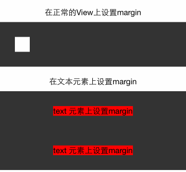
我们知道,对于 inline 元素,设置 margin-left 和 margin-right 有效,top 和 bottom 按理是不会生效的, 但是上图的结果可以看到,实际是生效了的。所以现在给我的感觉是 Text 元素更应该理解为一个不能设置 padding 的 block。
算了不要猜了, 我们看看官方文档怎么说 Text, https://facebook.github.io/react-native/docs/text.html
 <Text>
   <Text>First part and </Text>
   <Text>second part</Text>
 </Text>
 // Text container: all the text flows as if it was one
 // |First part |
 // |and second |
 // |part       |

 <View>
   <Text>First part and </Text>
   <Text>second part</Text>
 </View>
 // View container: each text is its own block
 // |First part |
 // |and        |
 // |second part|
也就是如果 Text 元素在 Text 里边,可以考虑为 inline, 如果单独在 View 里边,那就是 Block。
下面会专门研究一下文本相关的布局
文本元素
首先我们得考虑对于 Text 元素我们希望有哪些功能或者想验证哪些功能:
- 文字是否能自动换行?
- overflow ellipse?
- 是否能对部分文字设置样式 ,类似 span 等标签
先看看文字有哪些支持的 style 属性
/*==========TEXT================*/
 Attributes.style = {
   color string
   containerBackgroundColor string
   fontFamily string
   fontSize number
   fontStyle enum('normal', 'italic')
   fontWeight enum("normal", 'bold', '100', '200', '300', '400', '500', '600', '700', '800', '900')
   lineHeight number
   textAlign enum("auto", 'left', 'right', 'center')
   writingDirection enum("auto", 'ltr', 'rtl')
 }
实验 1, 2, 3
<Text style={[styles.text, styles.header]}>
     文本元素
 </Text>

 <View style={{backgroundColor: '#333333', padding: 10}}>
   <Text style={styles.baseText} numberOfLines={5}>
     <Text style={styles.titleText} onPress={this.onPressTitle}>
       文本元素{'\n'}
     </Text>
     <Text>
       {'\n'}In this example, the nested title and body text will inherit the fontFamily from styles.baseText, but the title provides its own additional styles. The title and body will stack on top of each other on account of the literal newlines, numberOfLines is Used to truncate the text with an elipsis after computing the text layout, including line wrapping, such that the total number of lines does not exceed this number.
     </Text>
   </Text>
 </View>
 styles = {
   baseText: {
     fontFamily: 'Cochin',
     color: 'white'
   },
   titleText: {
     fontSize: 20,
     fontWeight: 'bold',
   }
 }
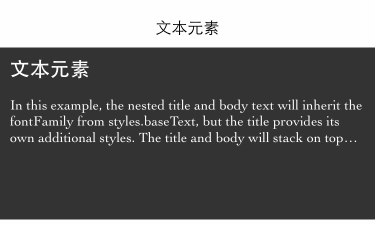
从结果来看 1,2,3 得到验证。 但是不知道各位有没有发现问题, 为什么底部空出了这么多空间, 没有设置高度啊。 我去除numberOfLines={5} 这行代码,效果如下:
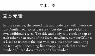
所以实际上, 那段空间是文本撑开的, 但是文本被numberOfLines={5} 截取了,但是剩余的空间还在。 我猜这应该是个 bug。
其实官方文档里边把numberOfLines={5}这句放到的是长文本的 Text 元素上的,也就是子 Text 上的。 实际结果是不生效。 这应该又是一个 bug。
Text 元素的子 Text 元素的具体实现是怎样的, 感觉这货会有很多 bug, 看官文
<Text style={{fontWeight: 'bold'}}>
 I am bold
 <Text style={{color: 'red'}}>
   and red
 </Text>
</Text>
Behind the scenes, this is going to be converted to a flat
NSAttributedString that contains the following information
"I am bold and red"
 0-9: bold
 9-17: bold, red
好吧, 那对于numberOfLines={5} 放在子 Text 元素上的那种 bug 倒是可以解释了。
Text 的样式继承
实际上 React-native 里边是没有样式继承这种说法的, 但是对于 Text 元素里边的 Text 元素,上面的例子可以看出存在继承。 那既然有继承,问题就来了!
到底是继承的最外层的 Text 的值呢,还是继承父亲 Text 的值呢?
<Text style={[styles.text, styles.header]}>
     文本样式继承
 </Text>

 <View style={{backgroundColor: '#333333', padding: 10}}>
   <Text style={{color: 'white'}}>
     <Text style={{color: 'red'}} onPress={this.onPressTitle}>
        文本元素{'\n'}
       <Text> 我是 white 还是 red 呢?{'\n'} </Text>
     </Text>
     <Text> 我应该是 white 的 </Text>
   </Text>
 </View>
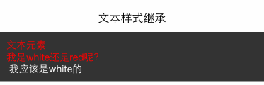
结果可见是直接继承父亲 Text 的。
总结
- react 宽度基于
pt为单位, 可以通过Dimensions来获取宽高,PixelRatio获取密度,如果想使用百分比,可以通过获取屏幕宽度手动计算。 - 基于 flex 的布局
- view 默认宽度为 100%
- 水平居中用
alignItems, 垂直居中用justifyContent - 基于 flex 能够实现现有的网格系统需求,且网格能够各种嵌套无 bug
- 图片布局
- 通过
Image.resizeMode来适配图片布局,包括contain,cover,stretch - 默认不设置模式等于 cover 模式
- contain 模式自适应宽高,给出高度值即可
- cover 铺满容器,但是会做截取
- stretch 铺满容器,拉伸
- 定位
- 定位相对于父元素,父元素不用设置 position 也行
- padding 设置在 Text 元素上的时候会存在 bug。所有 padding 变成了 marginBottom
- 文本元素
- 文字必须放在 Text 元素里边
- Text 元素可以相互嵌套,且存在样式继承关系
numberOfLines需要放在最外层的 Text 元素上,且虽然截取了文字但是还是会占用空间


