
如果你在开发工作中使用的是 React 框架,那么首当其冲要学习的就是思考如何设计组件。组件设计并非简单地将多个组件合成一个集合,而是需要思考如何设计更小、复用性更强的组件。例如,思考下面这张组件图:
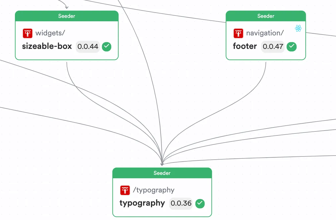
图中有三个组件,分别是:
Typography 组件
Footer 组件
Sizeable Box 组件
如图所示,Typography 组件同时被 Footer 和 Sizeable Box 组件使用。通常我们以为这样,就能构建一个简单、易维护和易排除错误的应用了。但其实只是这样思考组件的设计是远远不够的。
如果你知道如何从组件的视角思考问题,就可以通过在 React 组件中使用设计模式来提高代码的整体模块性、可扩展性和可维护性。
因此,下面这五种设计模式,是你在使用 React 时必须要掌握的。
模式一:基础组件
首先,在使用 React 时候,请尝试为应用设计基础组件。
基础UI组件,就是一个具备默认行为且支持定制化的组件。
例如,每个应用都会通过基础的样式、按钮设计或者基础的排版,来实现应用在视觉和交互上的一致性。这些组件的设计特点是:
组件会应用一组默认的配置。因此,使用者无需进行任何额外的配置,就可以快速基于默认配置使用组件。
组件可以支持定制化,使用者通过定制化可以覆盖组件的默认行为,从而为组件提供自定义的整体视觉和交互效果。
通过一个 Button 组件就能很好地说明基础组件模式的实现。示例如下:
Button 组件可能会有诸如空心、实心等不同形态。
Button 组件可能会有默认的文本。
现在你就可以利用基础组件模式进行设计,使组件的使用者可以改变其行为。请参考我基于基础组件模式完成的Button组件,示例代码如下:
import React, { ButtonHTMLAttributes } from 'react';// 按钮组件的形态:实心或者空心type ButtonVariant = 'filled' | 'outlined';export type ButtonProps = { /** * the variant of the button to use * @default 'outlined' */ variant?: ButtonVariant;} & ButtonHTMLAttributes<HTMLButtonElement>;;const ButtonStyles: { [key in ButtonVariant]: React.CSSProperties } = { filled: { backgroundColor: 'blue', // Change this to your filled button color color: 'white', }, outlined: { border: '2px solid blue', // Change this to your outlined button color backgroundColor: 'transparent', color: 'blue', },};export function Button({ variant = 'outlined', children, style, ...rest }: ButtonProps) { return ( <button type='button' style={{ ...ButtonStyles[variant], padding: '10px 20px', borderRadius: '5px', cursor: 'pointer', ...style }} {...rest}> {children} </button> );}
仔细观察代码会发现,这里 Button 组件的 props 类型合并了原生 HTML 中 button 标签属性的全部类型。这意味着,使用者除了可以为 Button 组件设置默认配置外,还可以设置诸如 onClick、aria-label 等自定义配置。这些自定义配置会通过扩展运算符传递给 Button 组件内部的 button 标签。
通过不同的上下文设置,可以看到不同的 Button 组件的形态,效果截图如下图。
这个可以查看具体设置:
https://bit.cloud/lakinduhewa/react-design-patterns/base/button/~compositions
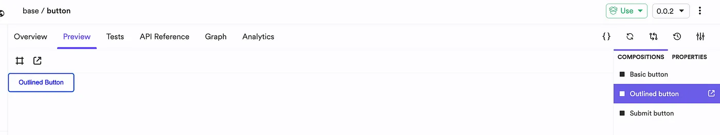
基础组件在不同上下文中的使用效果
通过不同的上下文,你可以设定组件的行为。这可以让组件成为更大组件的基础。
模式二:组合组件
在成功创建了基础组件后,你可能会希望基于基础组件创建一些新的组件。
例如,你可以使用之前创建的 Button 组件来实现一个标准的 DeleteButton 组件。通过在应用中使用该 DeleteButton,可以让应用中所有删除操作在颜色、形态以及字体上保持一致。
不过,如果出现重复组合一组组件来实现相同效果的现象,那么你可以考虑将它们封装到一个组件中。
https://bit.cloud/lakinduhewa/react-design-patterns/composition/delete-button
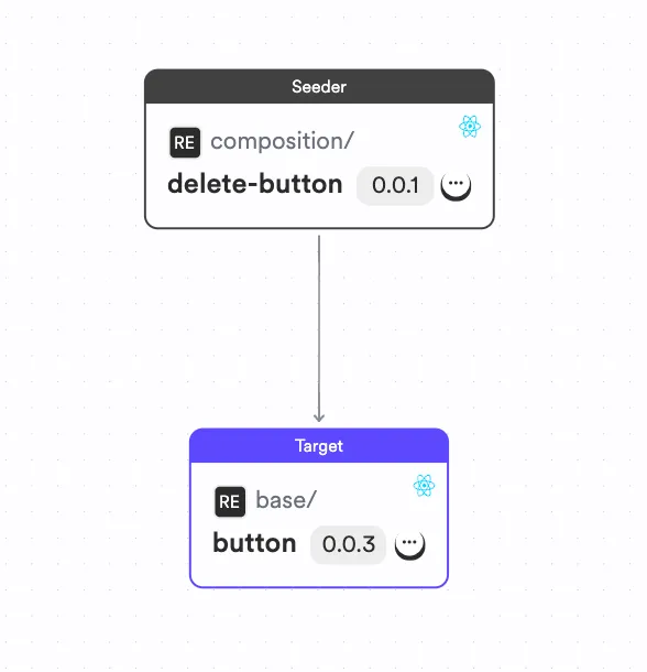
使用组合模式创建组件
如上面的组件依赖图所示,DeleteButton 组件使用基础的 Button 组件为所有与删除相关的操作提供标准的实现。下面是基本代码实现:
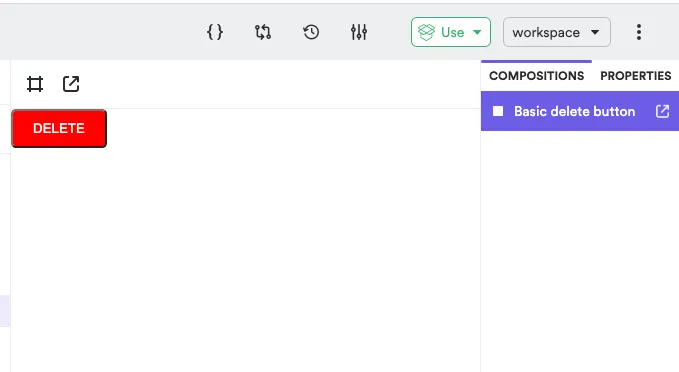
// 这里引入了,基础按钮组件和其propsimport { Button, ButtonProps } from '@lakinduhewa/react-design-patterns.base.button';import React from 'react';export type DeleteButtonProps = {} & ButtonProps;export function DeleteButton({ ...rest }: DeleteButtonProps) { return ( <Button variant='filled' style={{ background: 'red', color: 'white' }} {...rest} > DELETE </Button> );}
我们使用基于模式一创建的 Button 组件来实现的 DeleteButton 组件的效果如下:
现在我们可以在应用中使用统一的删除按钮。此外,如果你使用类似 Bit 的构建系统进行组件的设计和构建,那么当 Button 组件发生改变时,可以让CI服务自动将此改变传递到DeleteButton组件上,就像下面这样(当 Button 组件从 0.0.3 升级到了 0.0.4,那么 CI 服务会自动触发,将 DeleteButton 组件从 0.0.1 升级到 0.0.2):
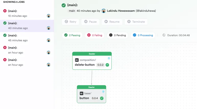
Bit 上的一个 CI 构建
模式三:使用 Hooks
React Hooks 是React v16就推出来的特性,它不依赖类组件实现状态管理、负效应等概念。简而言之,就是你可以通过利用 Hooks API 摆脱对类组件的使用需求。useSate 和 useEffect 是最广为人知的两个 Hooks API,但本文不打算讨论它们,我想重点讨论如何利用 Hooks 来提高组件的整体可维护性。
例如,请考虑下面这个场景:
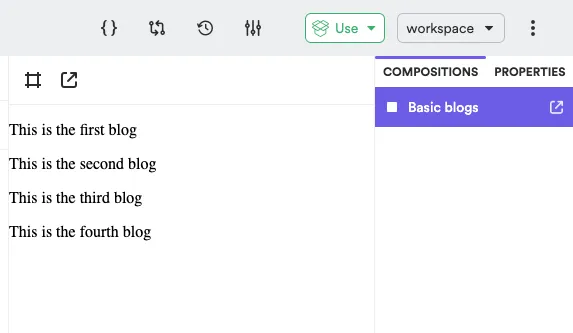
有一个 BlogList 组件。
BlogList 组件会通过调用一个简单的 API,获取博客文章列表数据,同时将其渲染在组件上。
基于上面的案例,你可能会像下面这样将 API 逻辑直接写在函数组件中:
import React, { useState, useEffect } from 'react';import axios from 'axios';const BlogList = () => { const [blogs, setBlogs] = useState([]); const [isLoading, setIsLoading] = useState(true); const [error, setError] = useState(null); useEffect(() => { axios.get('https://api.example.com/blogs') .then(response => { setBlogs(response.data); setIsLoading(false); }) .catch(error => { setError(error); setIsLoading(false); }); }, []); if (isLoading) return <div>Loading...</div>; if (error) return <div>Error: {error.message}</div>; return ( <div> <h2>Blog List</h2> <ul> {blogs.map(blog => ( <li key={blog.id}>{blog.title}</li> ))} </ul> </div> );};export default BlogList;
这样写,组件也能正常工作。它将会获取博客文章列表并且渲染在 UI 上。但是,这里将 UI 逻辑和 API 逻辑混在一起了。
理想情况下,React 组件应该不需要关系如何获取数据。而只需要关心接收一个数据数组,然后将其呈现在 DOM 上。
因此,实现这一目标的最佳方法是将 API 逻辑抽象到 React Hook 中,以便在组件内部进行调用。这样做就可以打破 API 调用与组件之间的耦合。通过这种方式,就可以在不影响组件的情况下,修改底层的数据获取逻辑。
其中一种实现方式如下。
1.useBlog hook
import { useEffect, useState } from 'react';import { Blog } from './blog.type';import { Blogs } from './blog.mock';export function useBlog() { const [blogs, setBlogs] = useState<Blog[]>([]); const [loading, setLoading] = useState<boolean>(false); useEffect(() => { setLoading(true); // 注意:这里的setTimeout非实际需要,只是为了模拟API调用 setTimeout(() => { setBlogs(Blogs); setLoading(false); }, 3000); }, []); return { blogs, loading }}
如上代码所示,useBlog hook 获取博客列表数据,然后赋值给状态变量,最后通过导出变量给到消费者(BlogList 组件)使用:
Hook 效果
2.BlogList 组件
import React from 'react';// 引入上面封装的 useBlog hookimport { useBlog } from '@lakinduhewa/react-design-patterns.hooks.use-blog';export function BlogList() { const { blogs, loading } = useBlog(); if (loading) { return ( <p>We are loading the blogs...</p> ) } return ( <ul> {blogs.map((blog) => <ol key={blog.id} > {blog.title} </ol>)} </ul> );}
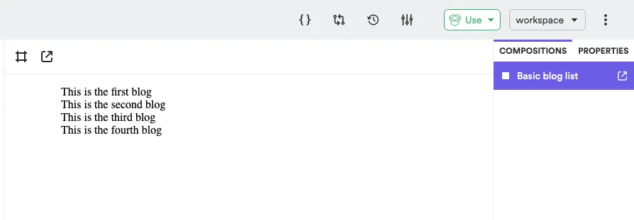
BlogList 组件效果
通过调用 useBlog 和使用其导出的状态变量,我们在 BlogList 组件中使用了 Hooks。如此,相对于之前,我们可以减少大量代码,并以最少的代码和精力维护两个组件。
此外,当你使用类似 Bit 这样的构建系统时(就像我一样),只需将 useBlog 组件导入本地开发环境,然后再修改完成之后重新推送回 Bit Cloud。Bit Cloud 的构建服务器可以依托依赖树将此修改传递给整个应用。因此如果只执行一些简单修改,甚至不需要访问整个应用。
模式四:React Providers
此模式的核心是解决组件状态共享。我们都曾是 props 下钻式传递的受害者。但如果你还没有经历过,那这里简单解释下:“props 下钻式传递”就是当你在组件树中进行 props 传递时,这些 props 只会在最底层组件中被使用,而中间层的组件都不会使用该 props。例如,看看下面这张图:
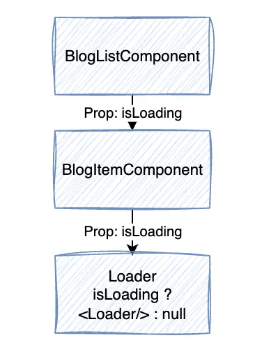
props 下钻式传递
从 BlogListComponent 一直向下传递一个 isLoading 的 props 到 Loader。但是,isLoading 只在 Loader 组件中使用。因此,在这种情况下,组件不但会引入不必要的 props,还会有性能开销。因为当 isLoading 发生变化时,即使组件没有使用它,React 依然会重新渲染你的组件树。
因此,解决方案之一就是通过利用 React Context 来使用 React Context Provider 模式。React Context 是一组组件的状态管理器,通过它,你可以为一组组件创建特定的上下文。通过这种方式,你可以在上下文中定义和管理状态,让不同层级的组件都可以直接访问上下文,并按需使用 props。这样就可以避免 props 下钻式传递了。
主题组件就是该模式的一个常见场景。例如,你需要在应用程序中全局访问主题。但将主题传递到应用中的每个组件并不现实。你可以创建一个包含主题信息的 Context,然后通过 Context 来设置主题。看一下我是如何通过React Context实现主题的,以便更好地理解这一点:
https://bit.cloud/lakinduhewa/react-design-patterns/contexts/consumer-component
import { useContext, createContext } from 'react';export type SampleContextContextType = { /** * primary color of theme. */ color?: string;};export const SampleContextContext = createContext<SampleContextContextType>({ color: 'aqua'});export const useSampleContext = () => useContext(SampleContextContext);
在 Context 中定义了一种主题颜色,它将在所有实现中使用该颜色来设置字体颜色。接下来,我还导出了一个 hook——useSampleContext,该 hook 让消费者可以直接使用 Context。
只是这样还不行,我们还需要定义一个 Provider。Provider 是回答 "我应该与哪些组件共享状态?"问题的组件。Provider的实现示例如下:
import React, { ReactNode } from 'react';import { SampleContextContext } from './sample-context-context';export type SampleContextProviderProps = { /** * primary color of theme. */ color?: string, /** * children to be rendered within this theme. */ children: ReactNode};export function SampleContextProvider({ color, children }: SampleContextProviderProps) { return <SampleContextContext.Provider value={{ color }}>{children}</SampleContextContext.Provider>}
Provider 在管理初始状态和设置 Context 可访问状态的组件方面起着至关重要的作用。
接下来,你可以创建一个消费者组件来使用状态:
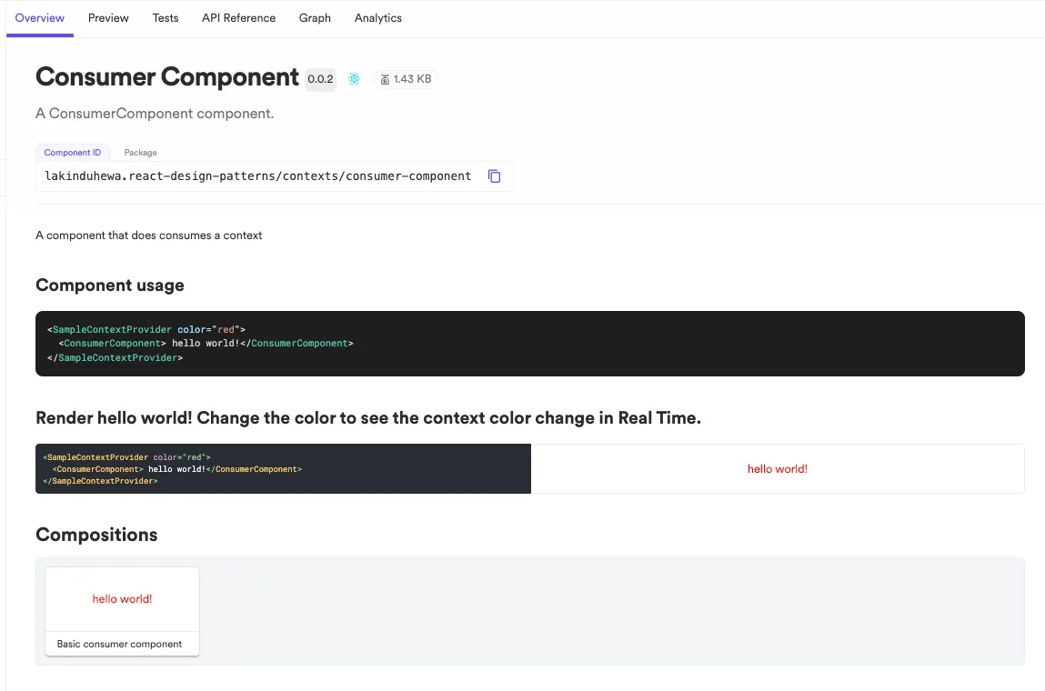
消费者组件
模式五:条件渲染
最后一个想和大家分享的是条件渲染模式。今天,人人都知道 React 中的条件渲染。它通过条件判断来选择组件进行渲染。
但在实际使用中我们的用法常常是错误的:
// ComponentA.jsconst ComponentA = () => { return <div>This is Component A</div>;};// ComponentB.jsconst ComponentB = () => { return <div>This is Component B</div>;};// ConditionalComponent.jsimport React, { useState } from 'react';import ComponentA from './ComponentA';import ComponentB from './ComponentB';const ConditionalComponent = () => { const [toggle, setToggle] = useState(true); return ( <div> <button onClick={() => setToggle(!toggle)}>Toggle Component</button> {toggle ? <ComponentA /> : <ComponentB />} </div> );};export default ConditionalComponent;
你是否注意到,这里我们将基于条件的逻辑耦合到了 JSX 代码片段中。通常,你不应该在 JSX 代码中中添加任何与计算相关的逻辑,而只将与 UI 渲染相关的内容放在其中。
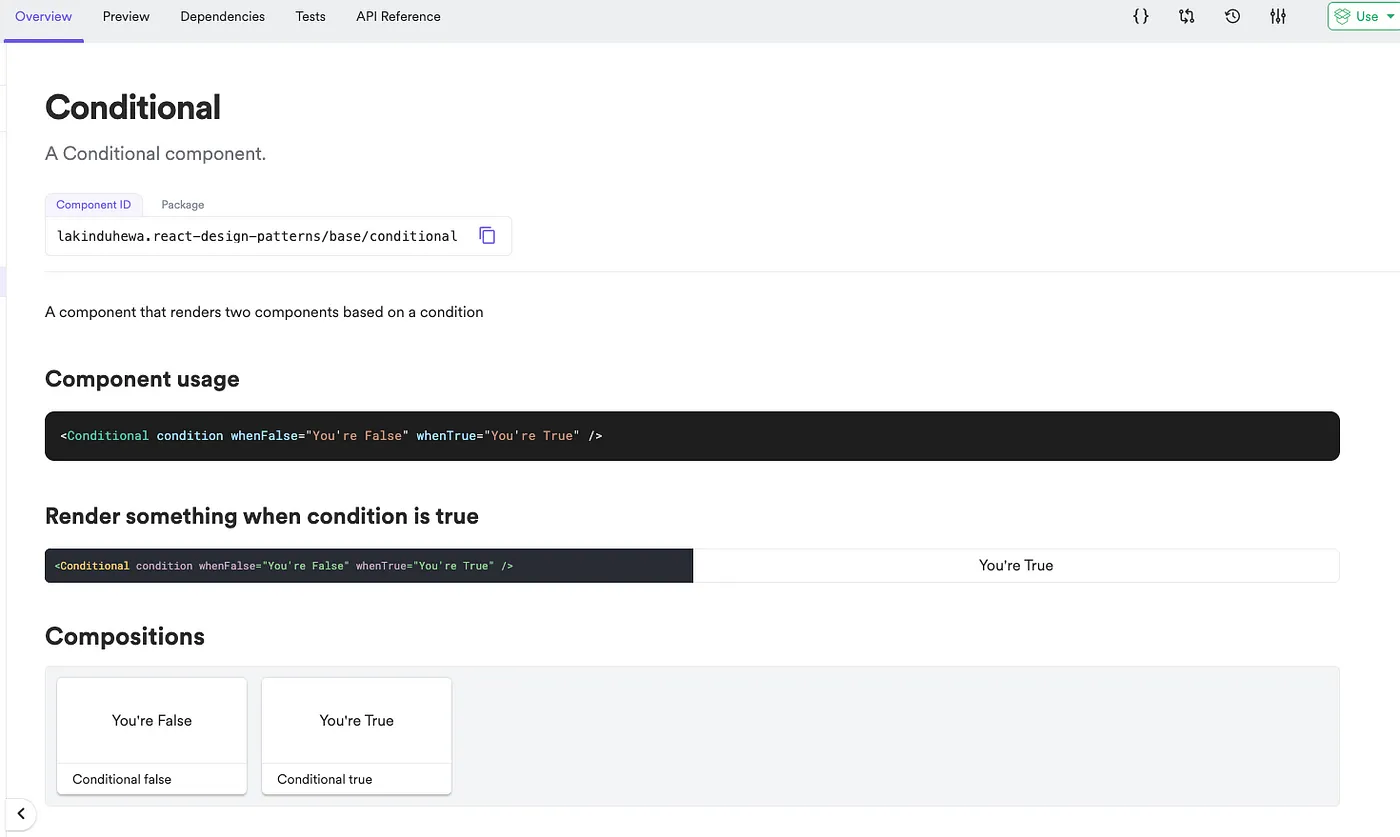
解决这个问题的方法之一是使用条件渲染组件模式。创建一个可重用的 React 组件,该组件可以根据条件渲染两个不同的组件。它的实现过程如下:
import React, { ReactNode } from 'react';export type ConditionalProps = { /** * the condition to test against */ condition: boolean /** * the component to render when condition is true */ whenTrue: ReactNode /** * the component to render when condition is false */ whenFalse: ReactNode};export function Conditional({ condition, whenFalse, whenTrue }: ConditionalProps) { return condition ? whenTrue : whenFalse;}
我们创建了一个可以按条件渲染两个组件的组件。当我们将其集成到其他组件中时,会使代码更简洁,因为无需在 React 组件中加入复杂的渲染逻辑。你可以像下面这样使用它:
export const ConditionalTrue = () => { return ( <Conditional condition whenFalse="You're False" whenTrue="You're True" /> );}export const ConditionalFalse = () => { return ( <Conditional condition={false} whenFalse="You're False" whenTrue="You're True" /> );}
实际的输入如下:
总结
掌握这五种设计模式,为 2024 年做好充分准备,构建出可扩展和可维护的应用吧。
如果你想详细深入本文中讨论的模式,请随时查看我在Bit Cloud的空间:
https://bit.cloud/lakinduhewa/react-design-patterns
感谢你的阅读!
原文链接:
https://blog.bitsrc.io/react-design-patterns-for-2024-5f2696868222


